About the project
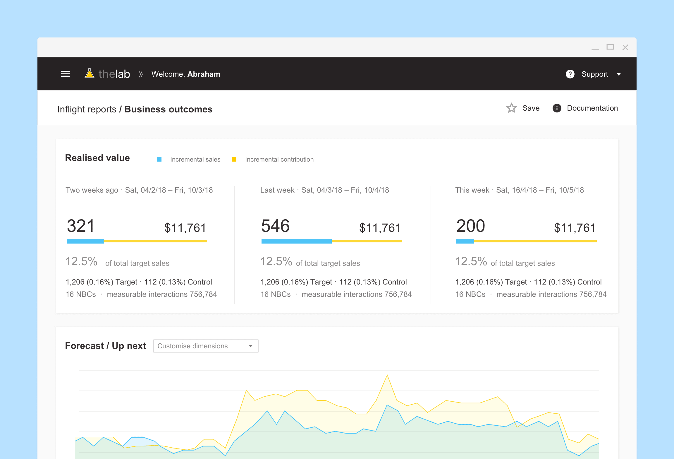
The Data and Decision Science division was a group of marketers, analysts and scientists behind the bank’s ‘next best conversations’ initiative — using customer insights to automatically generate campaigns to better engage customers. Since its inception, executives were keen to explore more robust way of reporting these campaigns’ performances and getting more insights out of the data we were collecting. Given that the system was new, the department is yet to find a consistent way to produce a single source of truth for performance reporting. I worked closely with the data visualisation and data science teams to come up with ideas/initiatives to improve the way we expose data, making sure it is adopted by analysts across the board in order to achieve the goal of 1 source of truth.
Current state audits, interviews and findings summary
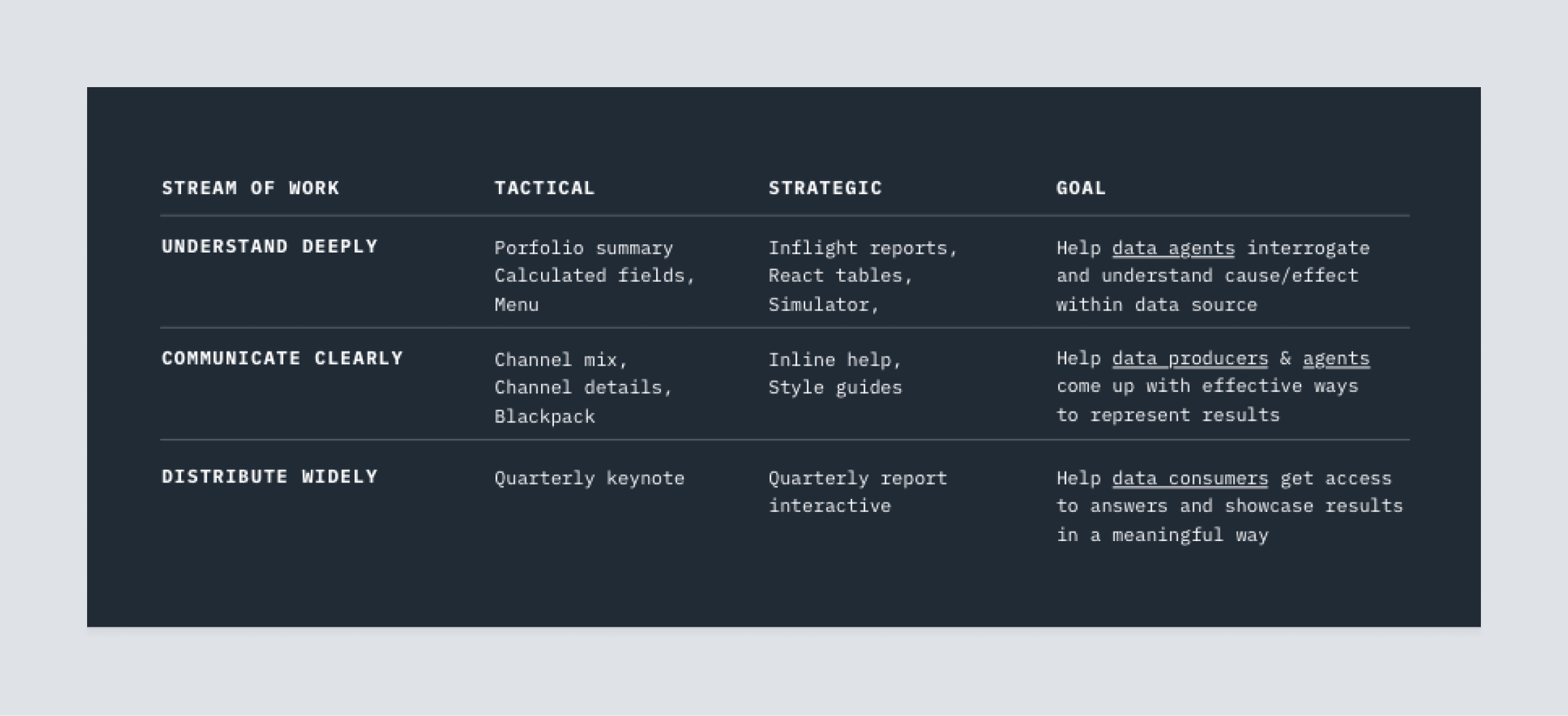
Based on my initial findings, I drew up some recommendations and initiatives that I can help my team with. As indicated below, some of the work would be come as requests from other teams (most of them are short-term tactical efforts to work around current challenges), some would be longer term strategic efforts and would take more time to fruition. However, giving each ‘initiative’ a clear goal helps the team understand the different nature of the work, the effort we should spend, and how it should be reported up and help management understand the impact we’re making for them.
Fostering Trust
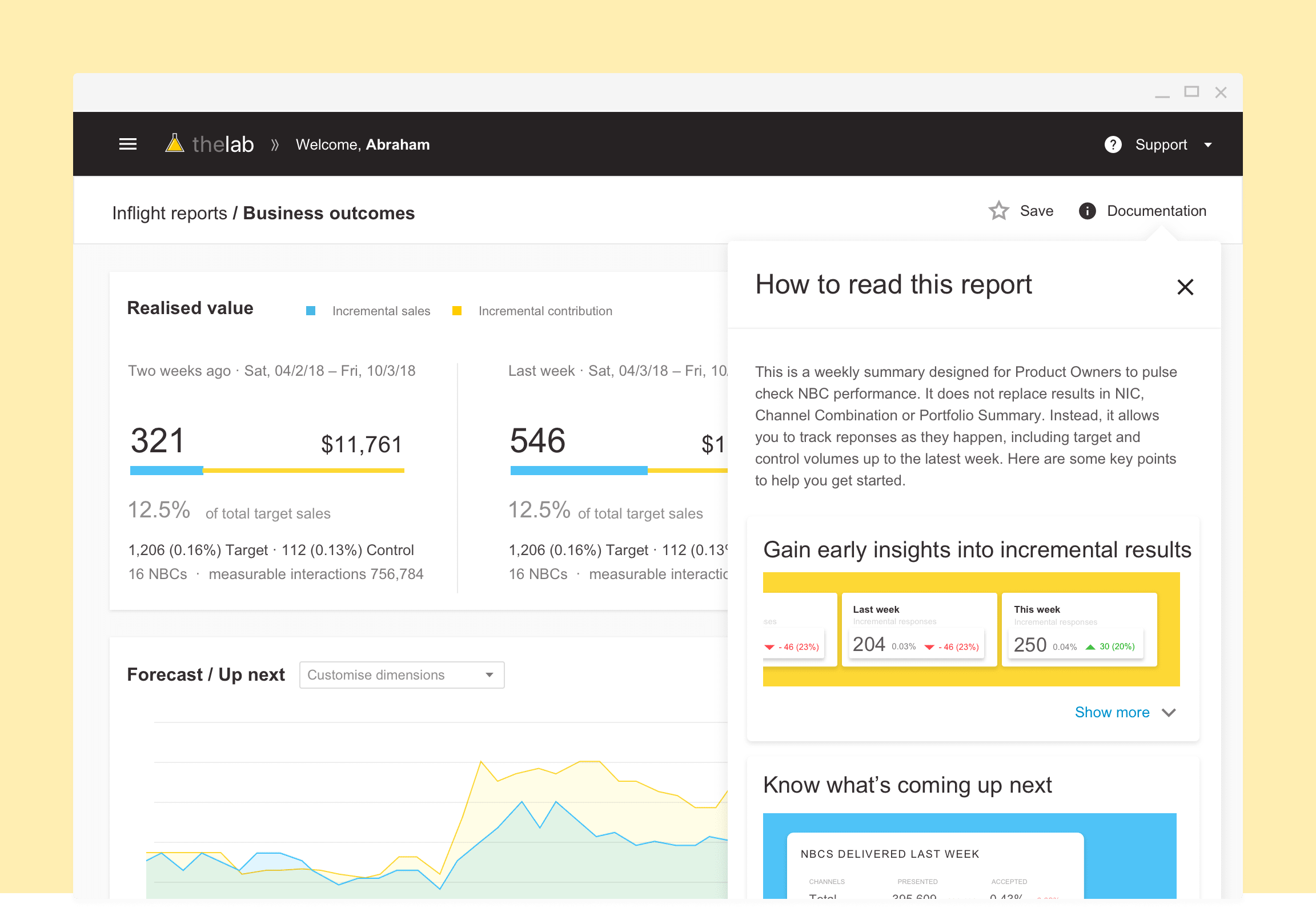
One of the main challenges when it comes to adopting a single source of truth is that people find it hard to trust the results because they couldn’t see the raw data that aligns to the real world. Especially for data agents, they would rather get access to the database and create their own results because they could have more control over the explanation of the results.However, some calculations and normalising are performed in the self service tools (Tableau), which is why governance team is trying to encourage a single source of truth through Tableau rather than the database. On the other hand, Tableau has its constraints user interaction and performance due to the way it was designed initially order to help data agents better understand what they were seeing in Tableau, I found a better way to work around those constraints and designed a table using ReactTables that would still be reading the correct information using Tableau’s data API instead of the interface. This allowed data agents to more freely interact with and interrogate the data behind the self service tool, resulting in better understanding and trust with the results.
Digestible Granular Data
Other than that, there were a number of nuances behind the calculations that weren’t necessarily clear to the novice user. One being the technicalities around Lagging indicators in relation to real time reporting. The other being the Simpson effect that would happen when results are filtered. Not only did this made it extremely difficult to report week-to-week or month-to-month results in real time. The results would also easily be misinterpreted if the audience were not educated or thoroughly briefed beforehand that were all addressed through the transition towards more powerful table filters
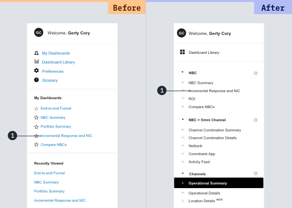
Audience led IA Reconfiguration
Data visualisation and Narrative
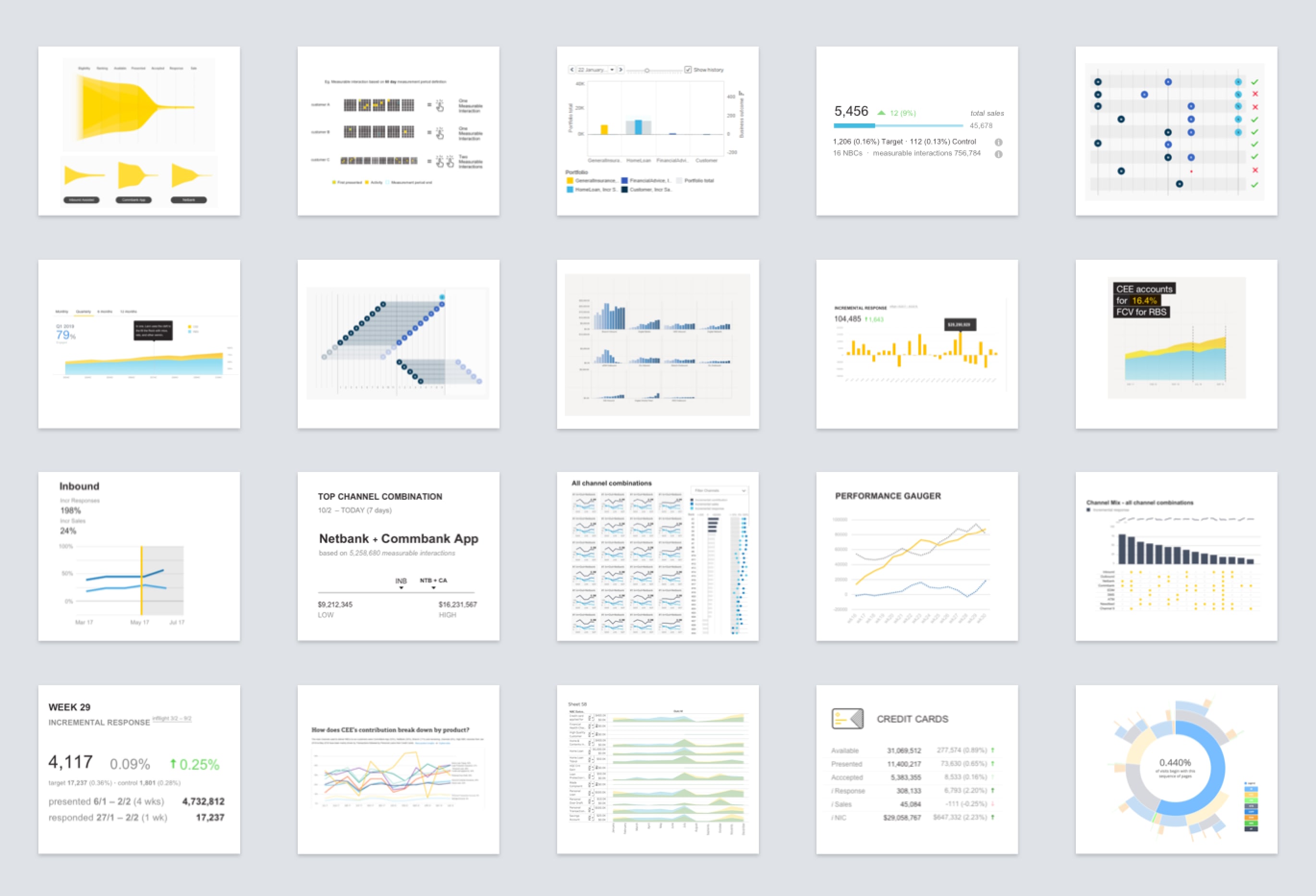
Majority of the time, a simple bar chart and table is enough to get an idea across quickly. But sometimes, through experimentation, trial and error, with different ways of representing data, we were able to discover patterns and insights that a bar chart couldn’t provide. On the other spectrum, sometimes, the right juxtaposition of text and symbols communicates results much quicker than a chart. Throughout my time here, I’ve tried out different ways to represent the same family of metrics. This includes investigating the feasibility of technology / platform (eg. Tableau vs D3.js vs Excel), choosing the right chart, researching novel ways to represent specific results. I’ve created a repository to document their pros and cons, constraints and context of use.This works as an ideation tool / tips and tricks document to help analysts better communicate their insights and reports.
Interactive Executive Reports
The dissemination of knowledge is to make information highly relevant, easily digestible readily available.
Apart from making sure metrics are adopted within the department, leadership team needed a way to communicate and share these results with stakeholders outside the Data and Decision Science division. The current solution was to produce a department wide slide deck that each team had to include some of their key findings during each quarter.The result was a slide deck of over 40 pages that people found hard to navigate and follow as a narrative. It also took analysts a lot of effort to pull together the results, summarise them and attend to the layout and details to make it presentable. I proposed a presentation platform that would reduce the need to manually style the slides, allow people to interact with the results, and worked with governance team to produce a coherent narrative collectively.