How much are you willing to pay to cycle to work? Given that the bike and the helmet is free. This is not a trick question. As we live in a world with limited resources, everything we do and not do, has a cost. Therefore decision making boils down to how much you are willing to pay.
This is a recording of my winning entry to the Geonext Hackathon held in November 2016
How far do people cycle to work?

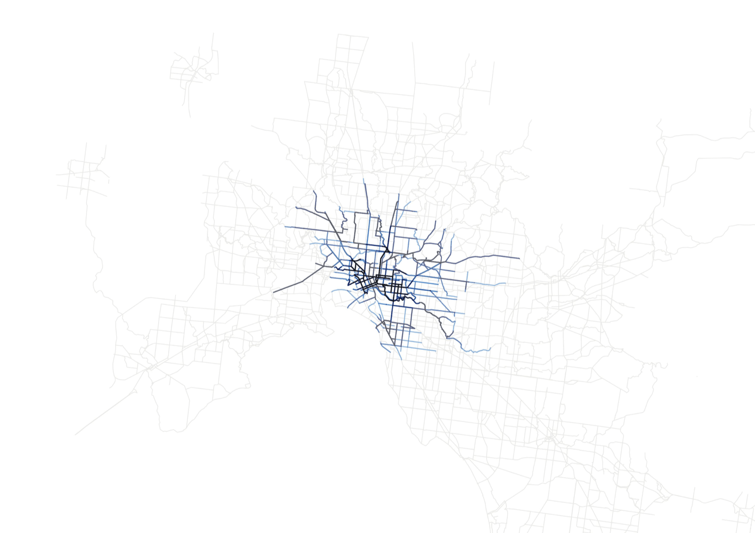
To make this explanation easier, let’s say the cost of driving is $10 per km. Riding a bike is much cheaper but there are still costs associated with maintaining the bike, purchasing safety gear etc and let’s say it costs someone $1 to cycle 1 km. And if we assume an average person is willing to pay up to $20 to cycle to work. This is the spatial catchment for those who could afford to cycle to work in Melbourne CBD.
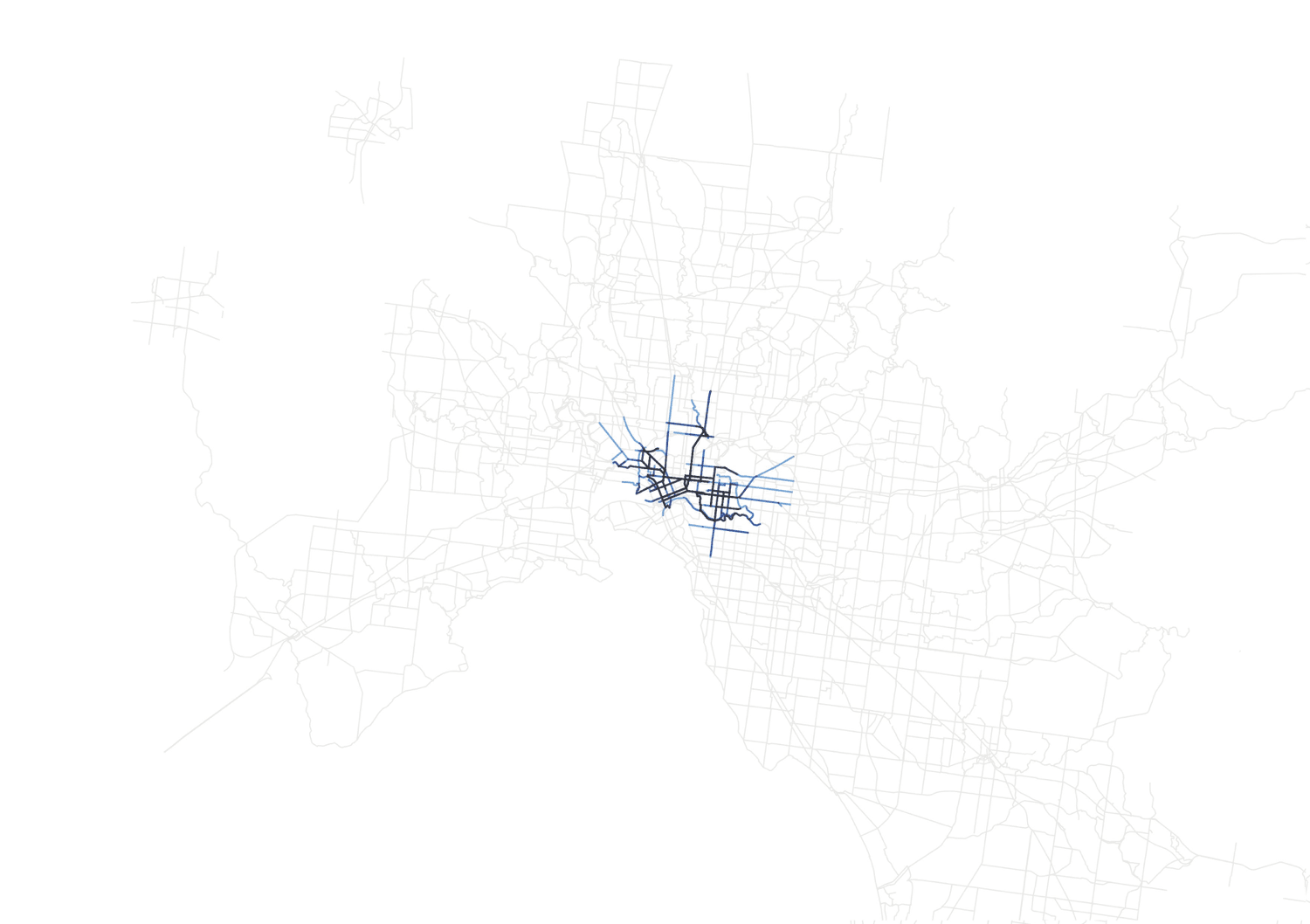
However, varying road conditions across the catchment may make it more difficult for some to cycle to the CBD. For example, route difficulty, bike path safety etc could inherently increase the cost of cycling. A cycling budget of $20 may only get someone the distance of 10kms or less, if we take into account these costs.
What does 20kms actually look like?

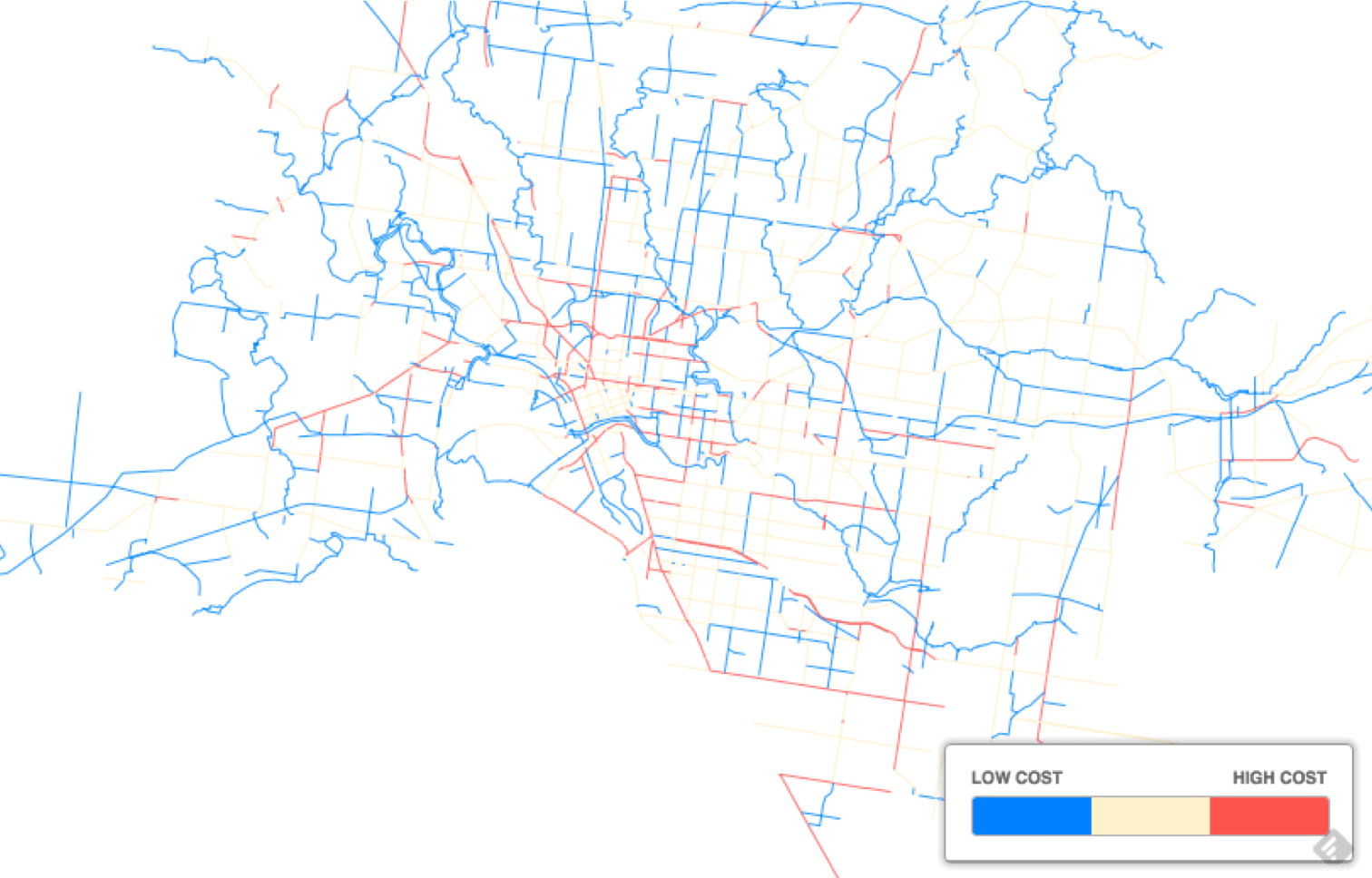
Distance costs include:
- Traffic flow – the heavier the traffic, the more expensive
- Heavy vehicles – The more heavy vehicles, the more expensive
- Bus lanes – Do cyclists have to share the road with buses?
- Traffic light stops – Are the roads appropriately signaled for cyclists?
- Crash history – Perceived road safety. The model assigns a higher cost to the road if crash volumes are higher.
- Slope – How flat is the road. The flatter the road, the cheaper.
Real Bikeable Distance

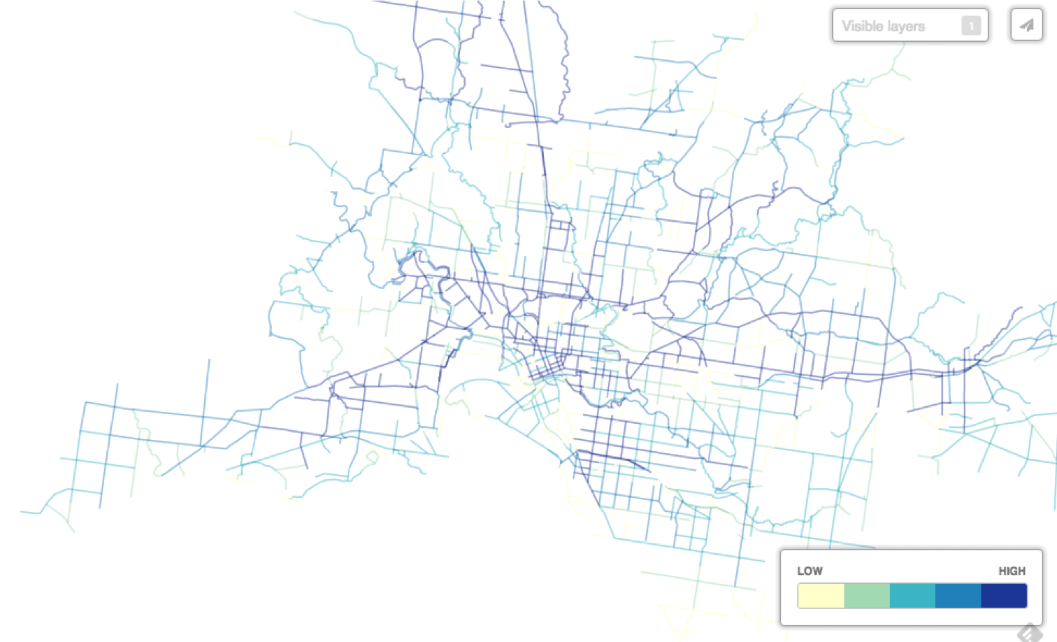
Potential bike paths to optimise
